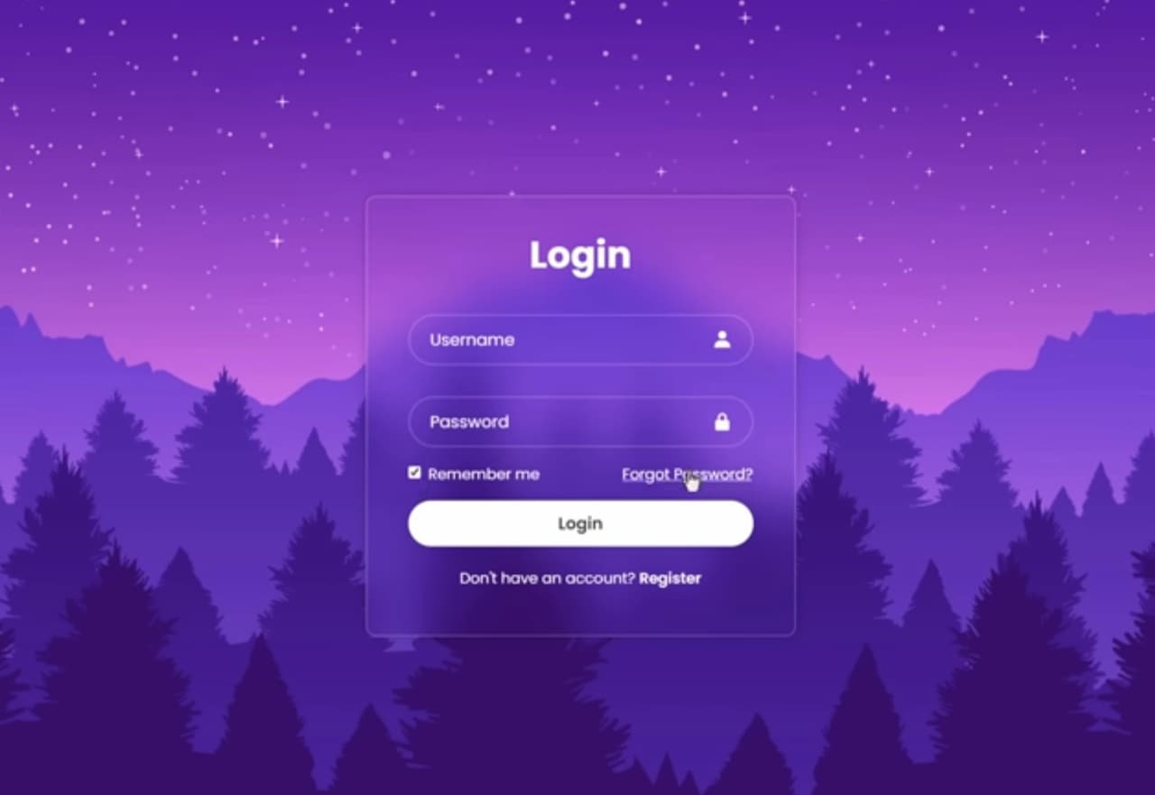
Login Box for Secure Access – XYZ Company
In the realm of the web, users engage in daily logins, a common occurrence that unfolds countless times each day. Typically, filling out a login form doesn’t demand excessive effort, but adopting a dropdown solution can expedite the process considerably.
Within the confines of this article, one can explore the art of crafting an aesthetically pleasing dropdown login form, harnessing the power of CSS3 and a hint of jQuery.
Unveiling the Concept
The primary objective of implementing a dropdown login form is to eliminate the need for users to endure the often tedious wait for a separate page to load when logging in. This approach represents a significant leap forward in enhancing the overall user experience. Instead of encountering the traditional login process that involves navigating to a new page, users can access their accounts promptly, right from the page they’re currently on. This seamless and efficient interaction contributes positively to user satisfaction and engagement. It aligns with the modern ethos of delivering quick and intuitive experiences in the digital realm, where every second counts, and user convenience reigns supreme.
The Ingredients
Recall the CSS3 buttons we previously conjured using HTML entities as icons? In this article, we’ll revisit this technique to showcase an arrow, symbolizing the current state of our dropdown login box – expanded or collapsed. In contrast to the HTML5 & CSS3 login tutorials you’ve encountered, this one incorporates jQuery to animate the box upon clicking the login button. Additionally, it takes advantage of HTML5’s new form features.
The HTML Structure
Here’s the markup that serves as the foundation for our CSS3 dropdown login:
```html
<nav>
  <ul>
    <li id="login">
      <a id="login-trigger" href="#"> Log in <span>▼</span> </a>
      <div id="login-content">
        <form>
          <fieldset id="inputs">
            <input id="username" type="email" name="Email" placeholder="Your email address" required>
            <input id="password" type="password" name="Password" placeholder="Password" required>
          </fieldset>
          <fieldset id="actions">
            <input type="submit" id="submit" value="Log in">
            <label><input type="checkbox" checked="checked"> Keep me signed in</label>
          </fieldset>
        </form>
      </div>
    </li>
    <li id="signup">
      <a href="">Sign up FREE</a>
    </li>
  </ul>
</nav>
```
The CSS Styling
Although the CSS code might appear extensive, the results are undoubtedly worth the effort. It bestows a polished appearance upon our dropdown login form.
The Magic of jQuery
The subsequent code requires little elucidation. The if…else statement plays a pivotal role in toggling the state of the login box. It dynamically switches the inner HTML of the span element between ▲ and ▼.
```javascript
$(document).ready(function(){
  $('#login-trigger').click(function(){
    $(this).next('#login-content').slideToggle();
    $(this).toggleClass('active');
    if ($(this).hasClass('active'))
      $(this).find('span').html('▲')
    else
      $(this).find('span').html('▼')
  })
});
```
And there you have it! We trust that you’ve found this tutorial both enlightening and enjoyable. Please don’t hesitate to share your thoughts in the comments. Your readership is greatly appreciated!
In conclusion
This article has delved into the world of web user interactions, shedding light on the ubiquitous login forms that users encounter daily. While filling out these forms is usually a straightforward task, the implementation of a dropdown solution, as showcased here, can significantly enhance the user experience. By reducing the need for separate page loads during login, this approach offers immediate access, a valuable asset in the fast-paced digital landscape.
We’ve explored the artistry of crafting an aesthetically pleasing dropdown login form, harnessing the capabilities of CSS3 and introducing a touch of jQuery for dynamic animations. Furthermore, we’ve embraced HTML5’s modern form features, ensuring that our login form is not only visually appealing but also technologically up-to-date.
The provided HTML structure serves as a robust foundation for our design, while the intricate CSS styling bestows an elegant and polished look upon our dropdown login form.
Finally, the jQuery code adds the element of interactivity, allowing users to toggle between an expanded and collapsed login box with ease. This intuitive behavior is achieved through a straightforward if…else statement, dynamically updating the arrow indicator.
We hope that you have found this tutorial both instructive and enjoyable. As you embark on your own web design endeavors, consider integrating these techniques to elevate your users’ login experience. Feel free to share your thoughts and questions in the comments section. Your engagement and feedback are invaluable to us, and we look forward to seeing your creative implementations in the ever-evolving web landscape.