The Ultimate Guide to Adjusting Tracking in Photoshop
Welcome to our comprehensive guide on adjusting letter spacing in Adobe Photoshop. Whether you’re aiming to enhance readability or achieve a visually appealing text arrangement, understanding how to modify tracking (horizontal spacing) is essential.
In this article, we’ll provide you with step-by-step instructions and valuable insights to help you tighten or loosen the spacing between letters effectively. From improving legibility to creating eye-catching headings for flyers and social media graphics, we’ve got you covered.
Let’s dive in and unlock the power of precise letter spacing in Photoshop.
What is Tracking in Photoshop and How Can You Adjust It?
Tracking refers to the amount of space between letters in a line of text, affecting both individual letters and the spacing between words. It’s a crucial aspect of typography that can impact readability and aesthetics. Loosening (or tightening) the space between letters expands the total length of the word and sentence.
In Adobe Photoshop, adjusting the space between letters is a straightforward process that can help elevate your design game. By varying the value, you can create dynamic and engaging graphics.
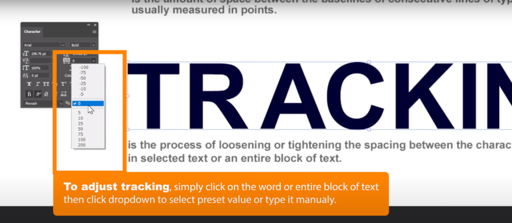
Here’s a step-by-step guide on how to adjust a block of text in Photoshop:
- Open your project file in Photoshop;
- Select the text you want to adjust or create a new text layer;
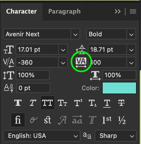
- Go to the “Window” menu and select “Character” to open the Character Panel;
- In the Character Panel, locate the “VA” icon and click on it;
- Enter a new value in the box or use the slider to increase or decrease the spacing between letters;
- Preview your text to see how the new value affects the spacing;
- When you’re satisfied with the result, save your project.
By following these simple steps, you can easily adjust the space between letters in Photoshop and create professional-looking designs. Experiment with different values to see which spacing works best for your project.
Harnessing the Potential of Tracking in Photoshop
In the world of design, the effective utilization of the process within Adobe Photoshop is a vital ingredient for elevating the legibility and visual allure of text. Beyond its practical applications, it serves as a creative tool to refine the style and professionalism of graphics and advertisements.
Let’s set forth on a captivating exploration, revealing the profound significance and transformative power of tracking in the realm of Photoshop.
Enhancing Readability
When dealing with extensive bodies of text, the sheer volume of words in a confined space can create a visually dense and overwhelming effect. Utilizing tracking allows for increased spacing between characters, making the text more breathable and easily digestible for the reader. By alleviating the congestion of letters, the overall readability improves significantly.
Elevating Graphic Style
Aesthetics play a pivotal role in capturing attention and conveying a message effectively. Tracking aids in enhancing the style of graphics and advertisements. For instance, when creating a printed flyer, sufficient spacing between letters is vital to ensure legibility from a distance and to enhance the visual appeal of the design.
By manipulating the process, designers can achieve the desired stylistic effect, making their creations visually appealing and engaging.
Fine-Tuning Professionalism
Often, it’s about the missing ingredient in elevating the professionalism and polished appearance of a project. By carefully adjusting the spacing between letters, designers can achieve a refined and sophisticated visual composition. Attention to the process of changing space between letters ensures that every aspect of the design is meticulously considered, leaving no room for unintentional clutter that may diminish the overall impact.
When working in Photoshop, it’s essential to assess the impact of different values within your specific project. This experimentation allows designers to identify the optimal spacing that strikes the perfect balance between readability and style.
Creating Captivating Headlines and Paragraphs
Typography is a crucial element in graphic design that can make or break the overall impact of your message. Fortunately, Adobe Photoshop offers an easy and effective way to enhance the readability and aesthetics of your text through tracking.
By adjusting the spacing between letters and words, you can create visually appealing and easy-to-read headlines and paragraphs that will capture your audience’s attention.
To get started, simply highlight your written headline or body text using the Type Tool in Photoshop. From there, you can manually adjust the spacing by entering a value in the Tracking Box or using the down arrow to increase it in increments of 10.
For a more streamlined approach, try using the shortcut method by holding down the Option key and clicking the left or right arrow keys until you achieve the desired spacing.
For Headlines:
- Highlight your written headline using the Type Tool in Photoshop;
- Manually adjust the spacing by entering a value in the Box (VA icon) or increase it by increments of 10 using the down arrow.
For Paragraphs/Body Text:
- Select the body text using the Type Tool in Photoshop;
- Adjust the spacing manually by entering a value in the Box or experiment incrementally until you achieve the desired spacing.
Streamlined Method (for a more efficient adjustment process):
- Select the text you wish to adjust;
- Hold down the Option key;
- Click the left or right arrow keys until you achieve the desired spacing.
Pro Tips on How to Use Tracking in Photoshop
Unleash the potential of the process in Photoshop with these expert tips and recommendations:
- Embrace the power of experimentation: Venture into the realm of different values, pushing the boundaries to discover the sweet spot where readability and aesthetics converge harmoniously. Also, dare to explore negative values for headlines, infusing your text with a bold and impactful visual punch;
- Seek Visual Consistency: Maintain a consistent value throughout your design for both headlines and paragraphs. This unifies your composition, creating a sense of visual harmony and cohesion;
- Synergize with typographic elements: Combine the art of adjustments with other typographic elements, such as font size, leading, and kerning. Each element contributes to the intricate dance of a well-balanced and visually pleasing composition;
- Adapt to Font Styles and Sizes: Remember that the ideal value varies depending on the font style and size. Embrace the iterative process of testing and refining until you achieve the desired outcome;
- Master Lengthy Documents with Ease: When dealing with extensive documents, harness the power of paragraph styles in Photoshop. Apply consistent settings throughout your text, ensuring a polished and professional result.
Using tracking in Photoshop is a powerful tool that can help you achieve more visually appealing and readable text. Experiment with different values to see what works best for your design, and don’t be afraid to create eye-catching headlines and paragraphs.
Tracking and Kerning in Photoshop
In the world of typography, the art of spacing letters is a fundamental skill that elevates the visual impact of your text. While both processes deal with adjusting space, they serve distinct purposes in shaping the final aesthetics of your design.
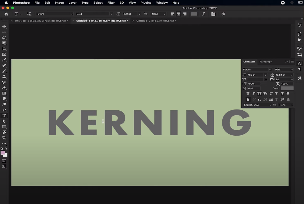
Tracking primarily affects the spacing between letters and words, allowing you to control the overall density and readability of the text. On the other hand, kerning is dedicated to adjusting the space between two individual letters, focusing on achieving optimal visual balance and harmony.
Mastering Kerning
To refine the space between two letters, follow these steps in Photoshop:
- Highlight the two letters you wish to adjust using the Type Tool (T);
- Hold down the Option key;
- Click the left and/or right Arrow Keys until you achieve the desired spacing, finding the sweet spot where the letters harmonize flawlessly.
Changing and Adjusting Tracking
Unlike kerning, tracking affects the overall spacing of letters and words. Here’s how you can modify and fine-tune the process in Photoshop:
- At any point during your project, you can make the necessary adjustments to refine the spacing;
- For detailed adjustments, reducing the values can be beneficial, allowing you to achieve precise spacing between characters.
Conversely, when working on larger-scale projects or aiming for more dramatic adjustments, increasing the value expands the spaces between characters, making a bold statement.
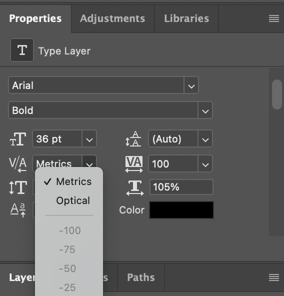
Metric vs Optical Tracking
Within Photoshop, you have the flexibility to choose between Metric and Optical options:
- Metric: This setting utilizes auto-tracking and kerning, employing preset spacing values that align with each font’s unique design characteristics. It ensures consistency and optimal spacing within individual font families;
- Optical: This setting considers the size and shape of each letter, adjusting the spacing accordingly. It works best when using multiple fonts, maintaining a visually balanced composition throughout your design.
By mastering the art of letter spacing, you can create visually captivating designs that seamlessly blend readability and aesthetics.
Conclusion
Mastering the art of tracking in Photoshop opens up a world of possibilities for designers and creatives. By understanding how to adjust the spacing between letters and words, you can greatly enhance the readability, aesthetics, and impact of your text-based designs. Whether you’re working on headlines, paragraphs, or intricate compositions, the ability to fine-tune the process empowers you to achieve the perfect balance between style and legibility.
Remember, experimentation is key. Don’t hesitate to test different tracking values and combinations to find the ideal setting for each design. Pay attention to how your results interact with other typographic elements, such as font size, leading, and kerning, to create harmonious and visually stunning compositions.