
Understanding Kerning in Adobe Photoshop
Typography, a crucial component in the world of graphic design, houses an array of terminologies that can often seem intimidating to beginners. Among these, ‘kerning’ is a pivotal term that holds significant relevance in the realm of text manipulation, particularly in Adobe Photoshop. If you’re a graphic designer, typographer, or simply a Photoshop enthusiast interested in text-based designs, understanding and mastering kerning can substantially enhance the visual appeal and readability of your work. This concept involves the adjustment of space between two characters in a word, aiming to create a visually balanced distribution that enhances both legibility and aesthetic charm.
Adobe Photoshop offers a wide array of tools for text manipulation, and kerning is one such tool that’s easy to use and can markedly impact the aesthetics of your design. This guide will take you through the basics of kerning, its significance in the design sphere, and a step-by-step explanation of adjusting kerning in Photoshop. Whether you’re a professional designer or a beginner trying to navigate the world of typography, this comprehensive guide will aid you in enhancing the visual quality of your text-based designs through effective kerning.
The Basics of Kerning
Kerning refers to the process of adjusting the space between two letters in a word. The ultimate goal of kerning is to achieve a visually harmonious distribution of space between each character, which enhances legibility and aesthetic appeal.
Let’s delve into the basics of kerning in the following table:
| Term | Definition |
|---|---|
| Kerning | It is the process of adjusting the space between two characters in a word. |
| Letter-spacing | It is the uniform spacing applied between all characters in a word or sentence. It differs from kerning as kerning only adjusts the space between two specific characters. |
| Tracking | It is similar to letter-spacing, but it affects the entire line or block of text. |
| Leading | It refers to the vertical spacing between lines of text. |
While kerning might seem trivial to some, it is vital in graphic design and typography. The right kerning can make your text more readable and visually pleasing, whereas poorly executed kerning can make the same text appear amateurish and challenging to read.
How Kerning Works in Adobe Photoshop
Adobe Photoshop provides a plethora of tools for manipulating text. Kerning is one such tool that is easy to use and significantly impacts the aesthetics of your design.
Here are the steps to adjust kerning in Photoshop:
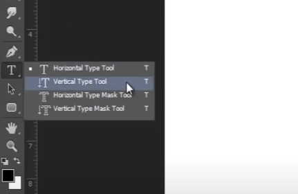
Select the Text Tool
Located in the toolbar, the Text Tool (represented by a “T”) allows you to create or edit text. To access and utilize the Text Tool, please follow these steps:
- Locate the toolbar: The toolbar is typically positioned at the top of the screen or within the editing software you are using;
- Identify the Text Tool icon: Look for the icon representing the Text Tool. It is commonly depicted as a capital letter “T.” The icon may vary depending on the software or application you are using;
- Click on the Text Tool icon: Use your cursor to click on the Text Tool icon. This action will activate the tool and allow you to proceed with creating or editing text;
- Create or edit text: Once the Text Tool is selected, you can start entering or modifying text. Place your cursor on the desired location within the document or canvas, and click to activate the text entry field;

- Customize text attributes: Many text tools offer various customization options, such as font type, size, color, and formatting. These options can typically be accessed through the toolbar or a floating text properties panel. Use these settings to achieve the desired appearance for your text;
- Enter or modify text content: With the text entry field activated, start typing or make changes to the existing text. The entered text will usually appear in real time on the document or canvas, allowing you to see the modifications as you type.
Select Your Text
To adjust the spacing between specific letters in your text, follow these steps:
- Select Your Text: Click and drag your cursor to highlight the specific letters between which you want to adjust the spacing. Make sure to select only the desired letters;
- Access the Spacing Options: Once the text is selected, go to the formatting options toolbar or menu in your text editing software. Look for the options related to spacing, which may be labeled as “Character Spacing,” “Letter Spacing,” or “Kerning”;
- Adjust the Spacing: Click on the spacing option and enter the desired value or use the provided slider to increase or decrease the spacing between the selected letters. Positive values will increase the spacing, while negative values will decrease it;
- Preview and Finalize: As you adjust the spacing, preview the changes in real time. Ensure that the spacing between the selected letters looks visually pleasing and maintains readability. Experiment with different spacing values until you achieve the desired result;
- Apply the Changes: Once you are satisfied with the spacing adjustments, click the “Apply” or “OK” button to confirm the changes. The adjusted spacing will be applied to the selected letters in your text.
Open the Character Panel
To open the Character panel in your text editing software and access various text options, follow these steps:
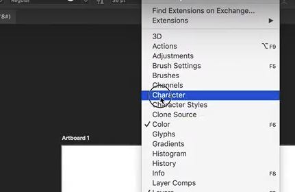
- Navigate to the Menu Bar: Look for the menu bar at the top of your screen. It usually contains options like “File,” “Edit,” “View,” and more, depending on the software you’re using;
- Click on “Window”: Click on the “Window” option in the menu bar. This will open a dropdown menu with various panels and windows that you can access;
- Select “Character”: In the dropdown menu, locate and click on the “Character” option. This will open the Character panel, which contains a range of text-related options and settings;
- Explore the Text Options: Once the Character panel is open, you can explore the available text options. These may include font selection, font size, font style (bold, italic, underline), text alignment, letter spacing, line spacing, and more. The specific options may vary depending on the software you’re using;
- Adjust Text Settings: To adjust the text settings, locate the corresponding options in the Character panel. You can click on the dropdown menus, input fields, or sliders to modify the desired settings;
- Preview and Apply Changes: As you adjust the text settings, preview the changes in real time. Make sure the text appears as desired and meets your requirements. Experiment with different settings until you achieve the desired result;
- Close the Character Panel: Once you have finished making the necessary adjustments, you can close the Character panel. You can usually do this by clicking the “X” button in the panel or selecting the “Close” option within the panel or the menu bar.
Adjust the Kerning
To adjust the kerning, which refers to the spacing between specific pairs of letters, follow these steps:
- Open the Character Panel: In your text editing software, navigate to the menu bar at the top of the screen;
- Click on “Window”: In the menu bar, locate and click on the “Window” option. This will open a dropdown menu with various panels and windows that you can access;
- Select “Character”: From the dropdown menu, choose the “Character” option. This action will open the Character panel, which contains different text-related options.
- Locate the Kerning Option: Inside the Character panel, look for a “VA” icon with an arrow beneath it. This icon represents the kerning option;
- Click on the Kerning Field: Click on the field associated with the kerning option. This will enable you to make adjustments;
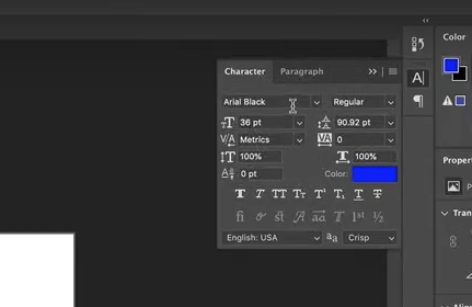
- Select a Preset Value or Input a Custom Value: Once you’ve clicked on the kerning field, a dropdown menu or an input field will appear. You have two options:
| Kerning Options | Description |
|---|---|
| Preset Value | If there are preset kerning values available, you can select one from the dropdown menu. These presets typically include options like “Auto,” “None,” “Metrics,” or specific values like “Very Tight,” “Tight,” “Standard,” or “Wide.” |
| Custom Value | Alternatively, you can manually input your desired kerning value in the input field. This allows for more precise control over the spacing between the selected letter pair. |
- Apply the Kerning Adjustment: After selecting a preset value or entering a custom value, the kerning adjustment will take effect immediately. Observe the changes in the spacing between the specific letter pair;
- Close the Character Panel: Once you have finished adjusting the kerning, you can close the Character panel. Look for the “X” button within the panel or select the “Close” option in the panel or the menu bar.
By default, Photoshop sets kerning to “Metrics,” which uses the kerning information provided by the font designer. The “Optical” option adjusts kerning based on the shapes of the letters, and it can be useful when the default kerning seems off.
How to Effectively Kern Text in Photoshop
While the process of kerning text in Photoshop is straightforward, effectively kerning requires a keen eye and some practice. Below are a few tips to help you kern like a pro:
Utilize Your Visual Perception
Typography is a form of art, and kerning is no exception to its creative essence. While metrics and preset values can offer guidance, nothing surpasses the discerning eye’s ability to perceive balance. Take a comprehensive view of your text and make kerning adjustments until it achieves visual harmony.
Take Font Size into Account
When working with larger fonts, it is crucial to consider increased kerning requirements. As the font size enlarges, the spaces between letters become more noticeable, potentially necessitating adjustments to kerning for optimal readability.
Familiarize Yourself with the Font and Typeface
Every font and typeface possesses unique kerning needs. For instance, serif fonts often demand more meticulous kerning compared to sans-serif fonts due to their ornamental strokes. Understanding these distinctions will guide you in achieving appropriate spacing.
Mind Problematic Letter Combinations
Keep an eye out for specific letter pairings such as “AV,” “WA,” “To,” and “TY,” which often require extra attention to kerning due to their distinctive shapes. Adjusting the spacing between these letters ensures legibility and avoids awkward visual gaps.
Conclusion
Mastering kerning in Adobe Photoshop is vital for graphic designers. Proper kerning, the adjustment of space between letters, significantly enhances the legibility and aesthetic appeal of text-based designs. With user-friendly tools like the Text Tool and Character panel, designers can achieve visually balanced typography and create professional-looking designs that are easy to read.
Understanding kerning empowers designers to elevate the quality of their typography. By carefully adjusting letter spacing, designers can enhance the overall visual impact and create engaging designs that capture attention. With Adobe Photoshop’s intuitive tools, designers can easily achieve harmonious kerning, resulting in visually pleasing and effective text-based designs.